KRISPY KREME
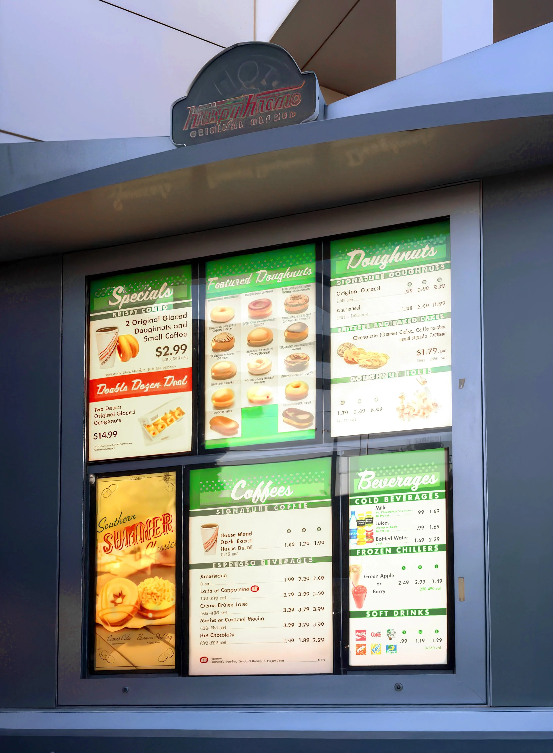
Menu Signage Refresh
I had a lot of fun revamping the Kripsy Kreme menu signage. It was a great opportunity to do research and lean into a ‘50s motif.
The most challenging portion of this job was collating all the revisions I’d receive directly from the client. I made checklists shared with the client and our second shift Project Manager to ensure nothing was overlooked. This was especially important, since the menu prices, offerings, and caloric information varied by state.
This job was a great opportunity to combine my graphic design skills with my project management abilities. The project went so well that the client gave me a branded bicyclist jersey (replete with a giant doughnut on the back) for my outstanding work and effort.


